Turning a low-conversion eCommerce platform into a revenue-driving retail channel
Improving discovery and reducing friction transformed the website into a key driver of revenue and retail engagement.
Overview
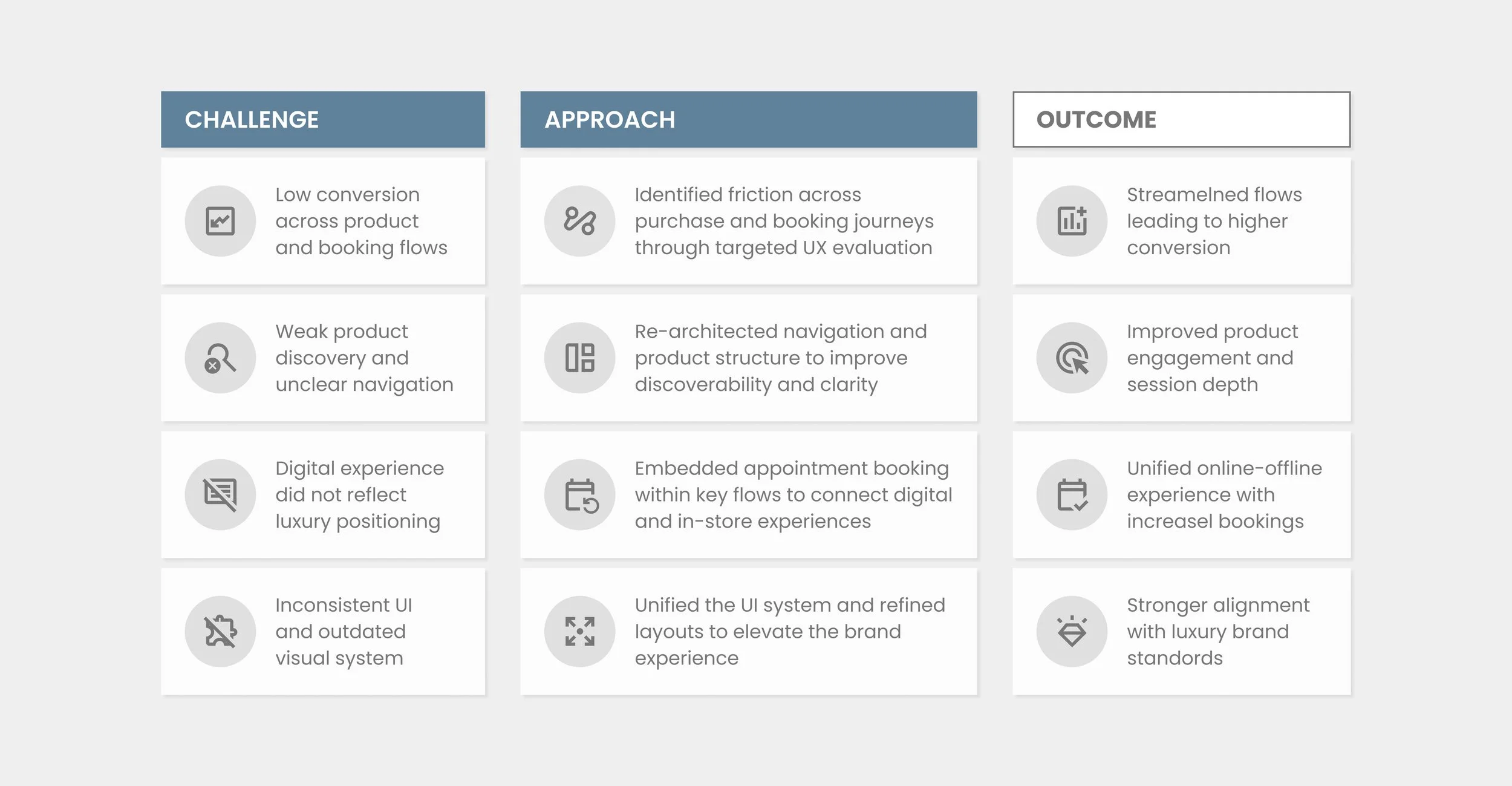
Edward Beiner’s digital platform was underperforming as a revenue channel, with low conversion and limited impact on in-store traffic. As part of the design team, I owned key areas of the UX/UI redesign, focusing on product discovery, visual hierarchy, and reducing friction across the purchase journey.
Key Focus Areas
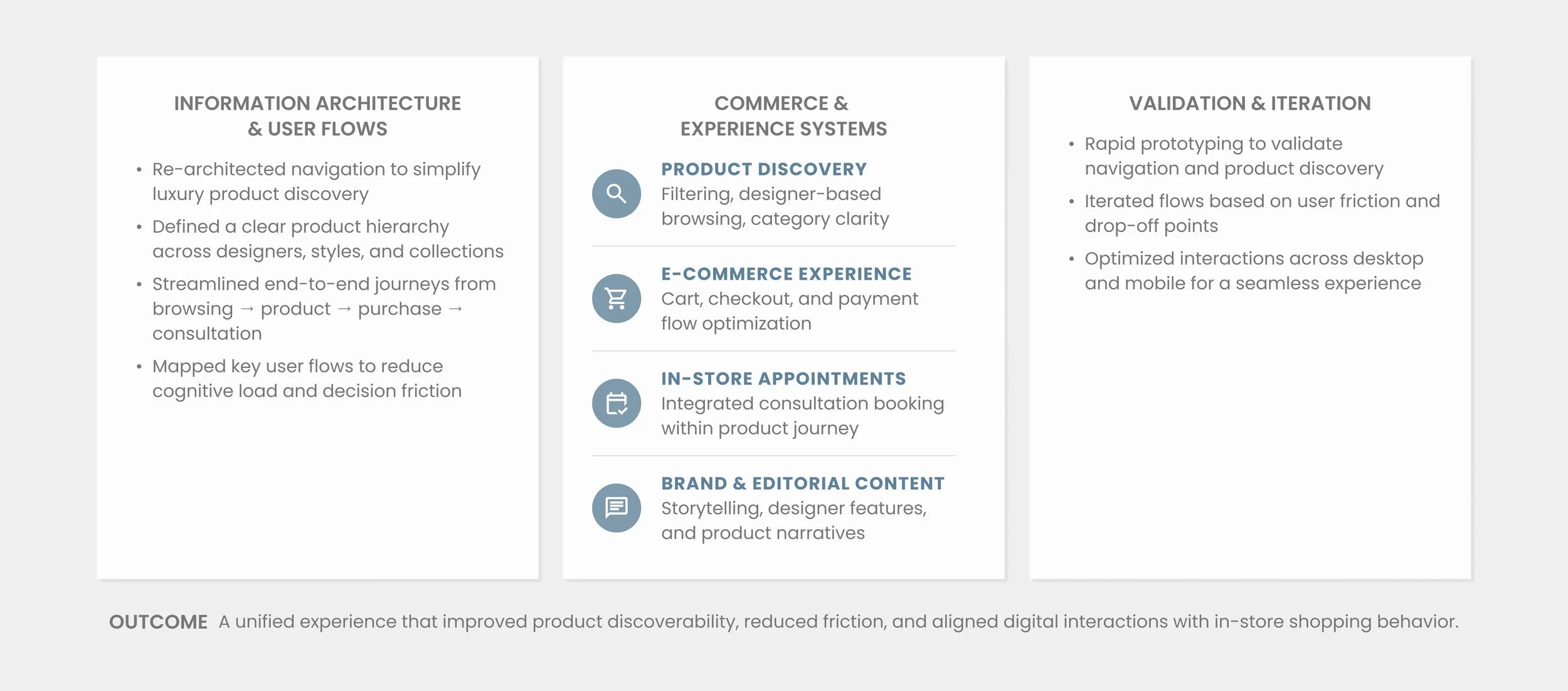
• Improve product discoverability to support conversion
• Reduce friction across the purchase journey
• Strengthen connection between digital and in-store experience
• Elevate brand perception through a premium UI system
My Role
Product Designer
Visual Direction
Art Direction
Client
Edward Beiner
Website
edwardbeiner.com
Team
Valeria Diaz (PM)
Sebastian Roach (VD)
Aldo Mora (PD)
Victor Hugo (3DM)
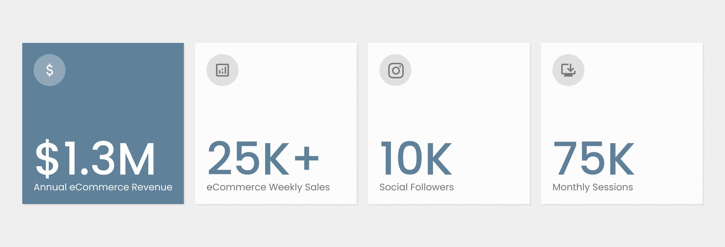
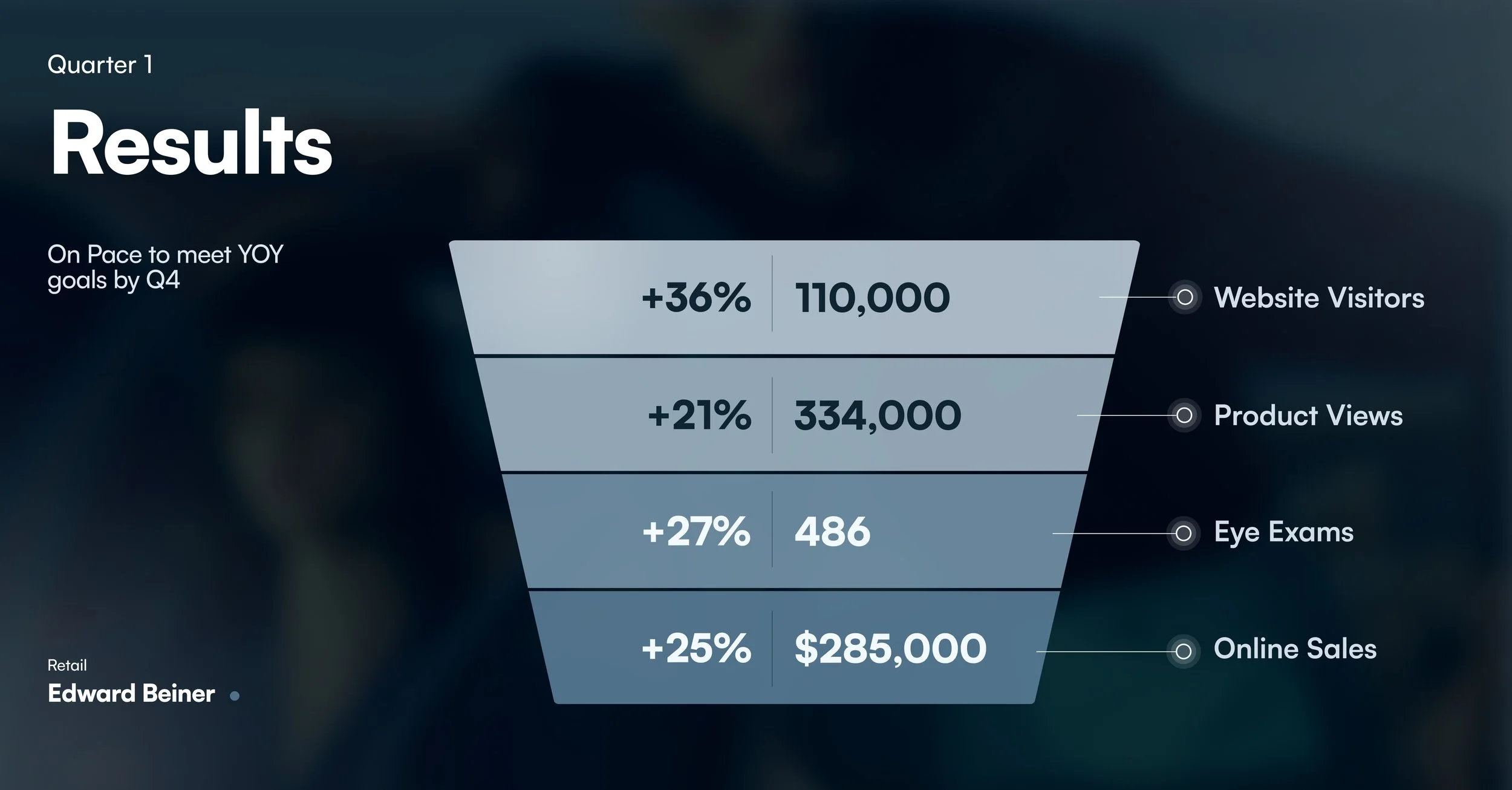
PROJECT IMPACT
Driving measurable growth across conversion and revenue
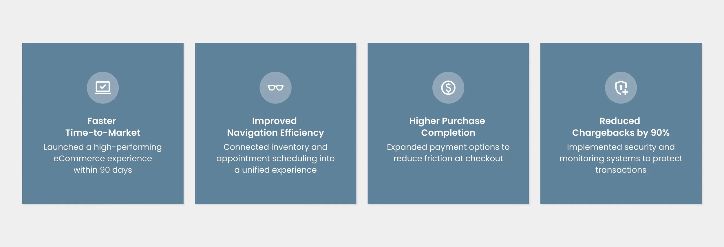
The redesigned experience helped strengthen Edward Beiner’s digital platform as a more cohesive commerce and engagement channel. By improving product discovery, refining navigation clarity, and creating stronger connections between shopping and eye care services, the platform supported clearer customer journeys across both digital and in-store experiences. These improvements contributed to stronger user engagement, increased digital visibility, and measurable business growth.
DISCOVERY & STRATEGY
From friction to focused design interventions
The discovery phase focused on understanding how users navigated between luxury commerce and eye care services across the existing platform. Through UX evaluation, competitor analysis, and structural review, we identified friction points related to fragmented navigation, inconsistent content hierarchy, and disconnected customer journeys. These insights helped inform a clearer experience strategy centered around improving product discovery, simplifying appointment-related pathways, and creating a more cohesive relationship between digital commerce and in-store engagement.
PROJECT OBJECTIVE
Defining Success Metrics
The project aimed to transform Edward Beiner’s digital platform into a more intuitive and scalable luxury eCommerce experience that better connected product exploration with eye care services. The redesign focused on improving navigation clarity, simplifying product discovery, and creating more seamless pathways between browsing, shopping, and appointment-related interactions. By establishing clearer structural systems and a more cohesive user journey, the experience was designed to support both customer engagement and long-term digital growth.
PROJECT TIMELINE
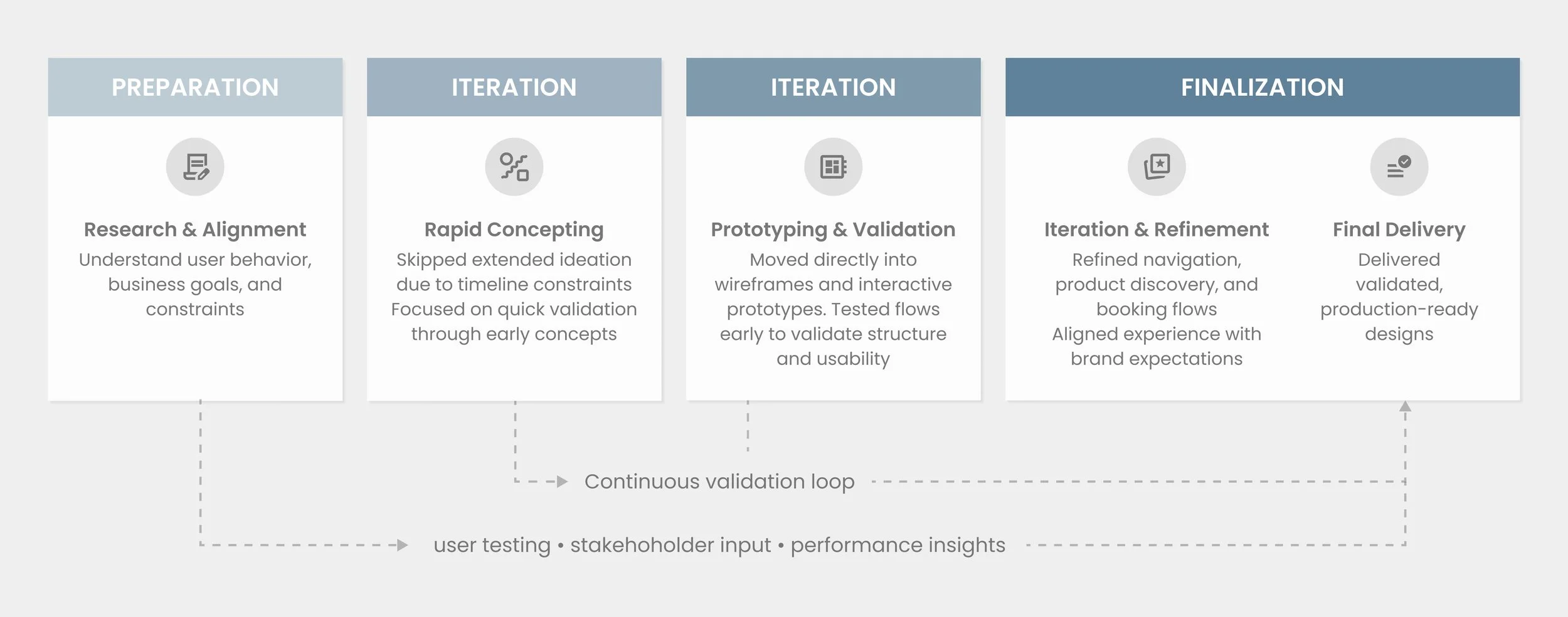
End-to-end design process
The redesign evolved through a collaborative and iterative process focused on validating structure, refining user flows, and aligning business goals with customer needs across each phase of the project. From early UX evaluation and wireframing to high-fidelity interface design and system refinement, each stage helped establish a more cohesive and scalable experience framework for the platform.
EXISTING PLATFORM
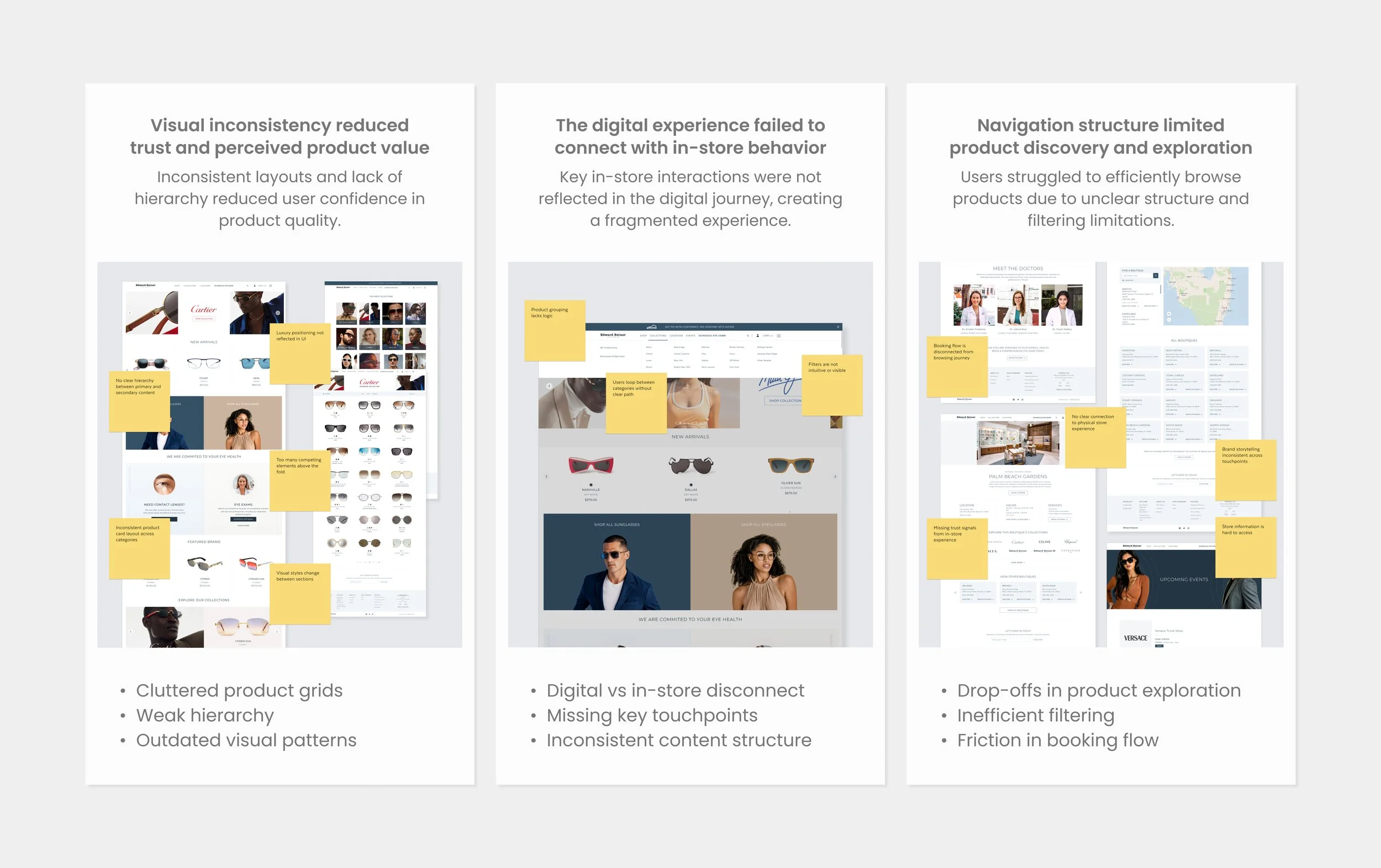
Design audit to existing website
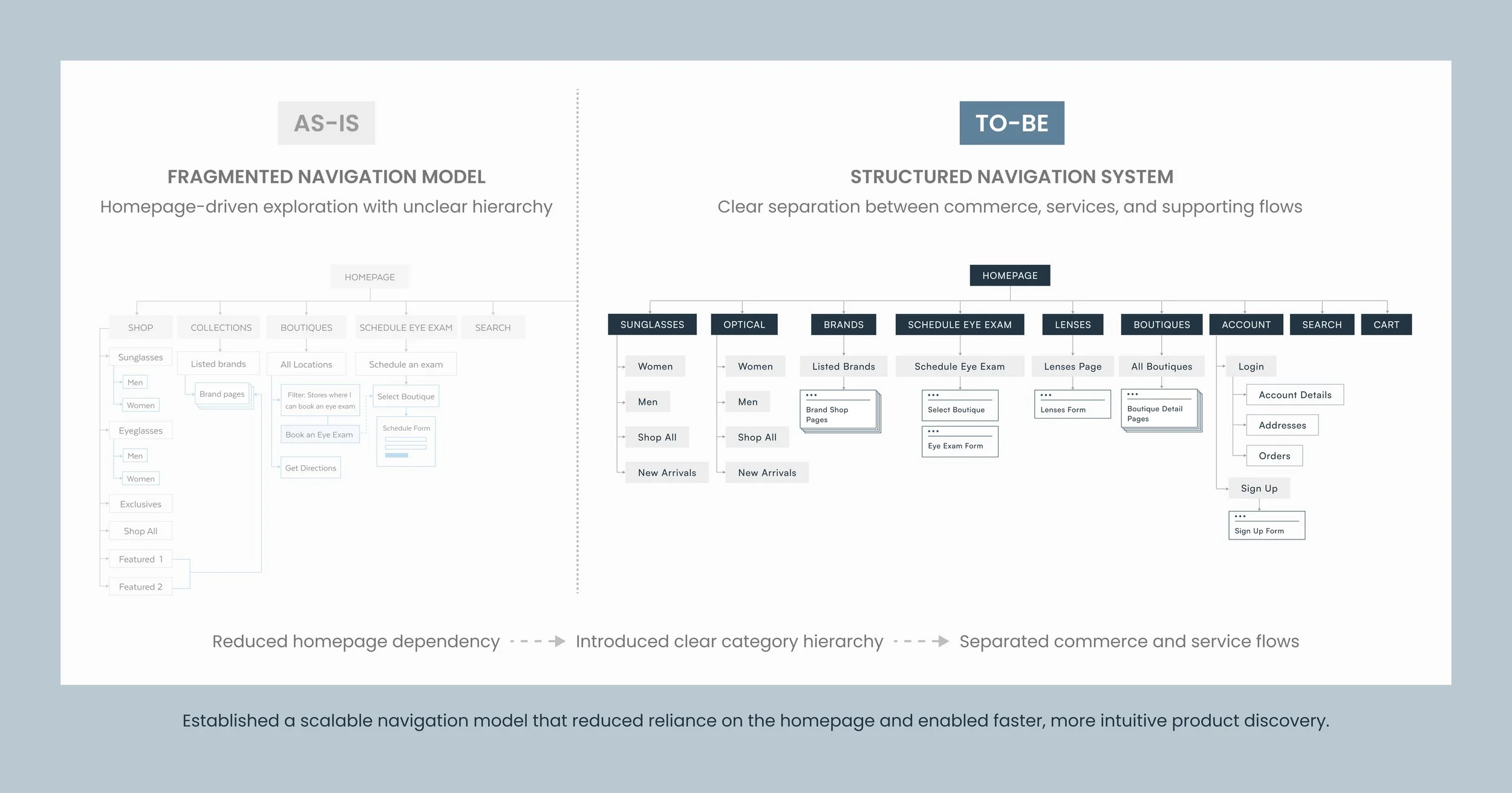
The existing platform presented several structural and usability challenges that limited both product exploration and customer engagement. Navigation patterns lacked consistency across key touchpoints, content hierarchy often competed for attention, and the relationship between commerce and eye care services felt disconnected throughout the experience. These issues created unnecessary complexity across browsing and appointment-related journeys, making it more difficult for users to navigate the platform with clarity and confidence.
PLANNING & STRUCTURE
Translating insights into product systems
The planning phase focused on restructuring the platform’s information architecture and establishing clearer relationships between commerce, content, and eye care services. By evaluating navigation systems, page hierarchy, and key user pathways, we developed a more organized and scalable framework that simplified how users moved across the experience. This process helped align structural decisions early, creating a stronger foundation for product discovery, appointment-related interactions, and overall usability throughout the platform.
PROBLEM STATEMENT
How can Edward Beiner transform its digital platform into a revenue-driving channel that increases online sales while integrating appointment booking to drive in-store eye exams?
REBUILDING
Re-architecting navigation and system structure
The rebuilding phase focused on redefining the platform’s core experience through more intentional navigation systems, clearer page structures, and refined interaction patterns. By reorganizing content relationships and simplifying key customer pathways, the redesign introduced a more cohesive framework that better connected luxury commerce with eye care services. This process helped create a more intuitive and scalable experience while establishing stronger consistency across the platform’s primary touchpoints.
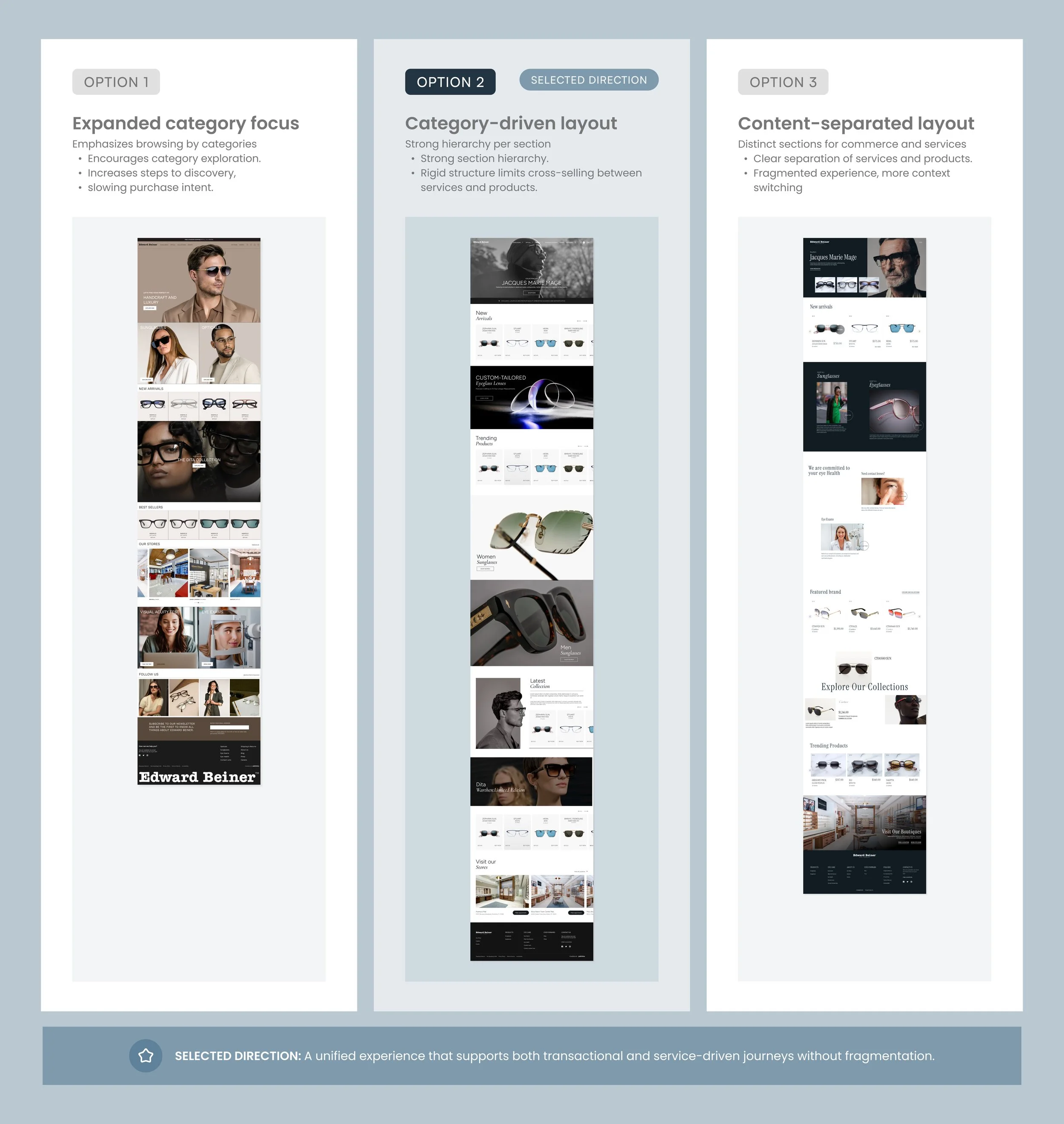
STRATEGIC DECISION
Balancing Commerce & Eye Care Services
One of the key challenges during the redesign was creating a clearer relationship between luxury commerce and eye care services without overwhelming the experience. The existing platform treated shopping and service-related interactions as largely separate journeys, creating friction between product exploration, appointment scheduling, and in-store engagement. During the planning phase, we explored ways to better integrate these experiences through navigation structure, content prioritization, and more connected user pathways. This approach helped create a more cohesive framework that supported both product discovery and service accessibility while maintaining the brand's premium positioning.

INITIAL IDEATION
Validating page hierarchy and content placement
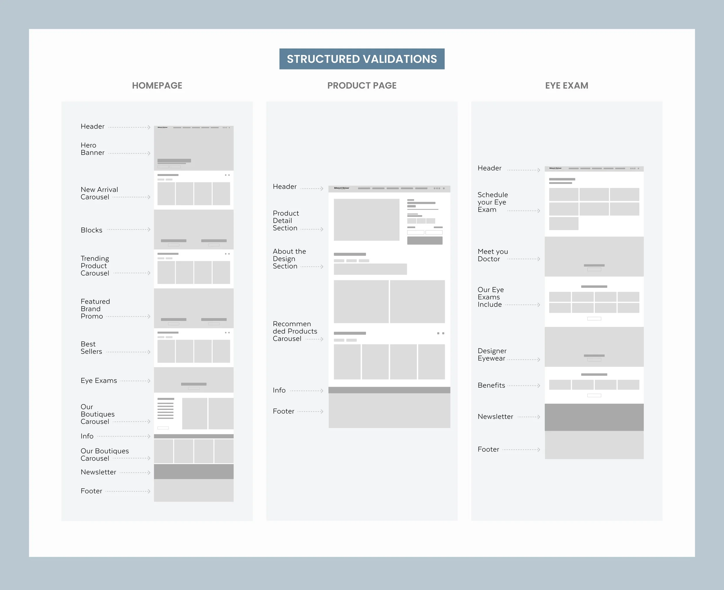
The initial ideation phase focused on exploring early experience directions and validating how users would navigate key interactions across the platform. Through low-fidelity concepts and structural explorations, we tested different approaches to content organization, navigation behavior, and page composition before moving into visual refinement. This process helped establish clearer pathways between product discovery, shopping flows, and eye care services while creating a stronger foundation for a more cohesive user experience.
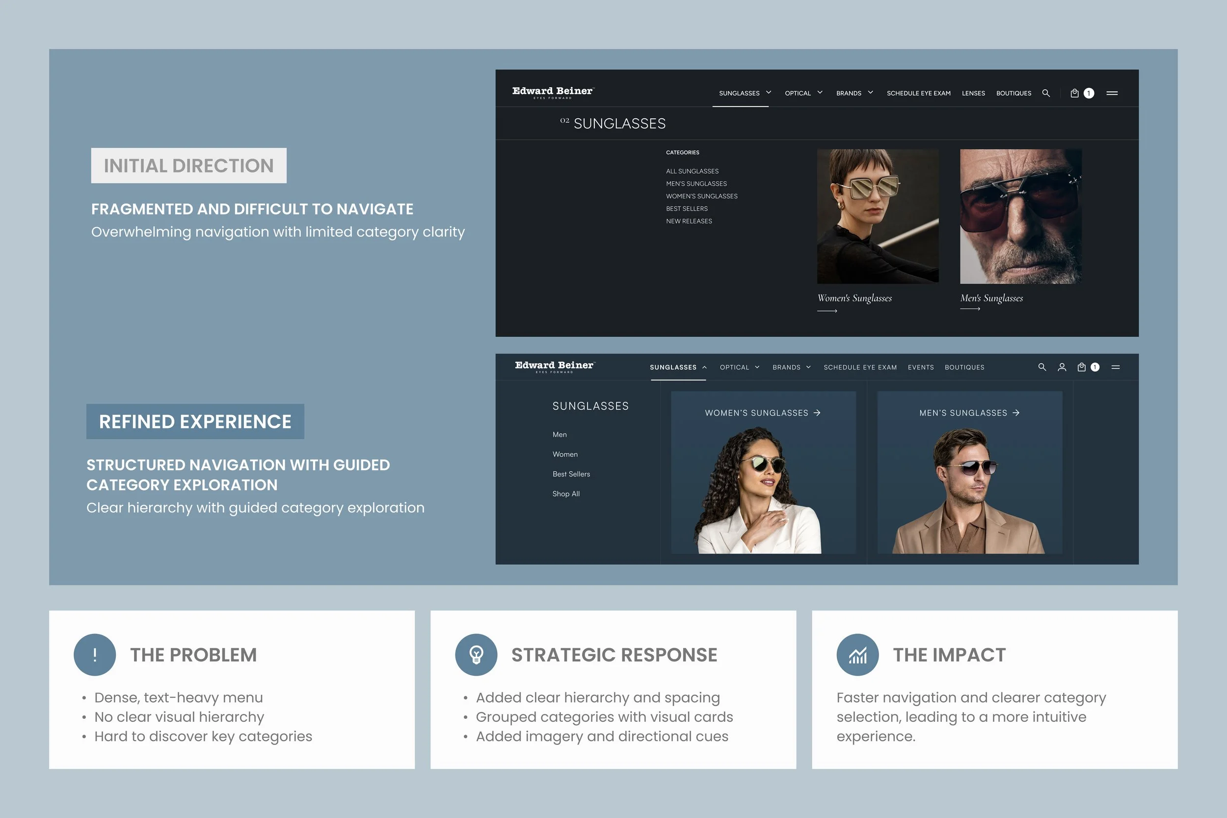
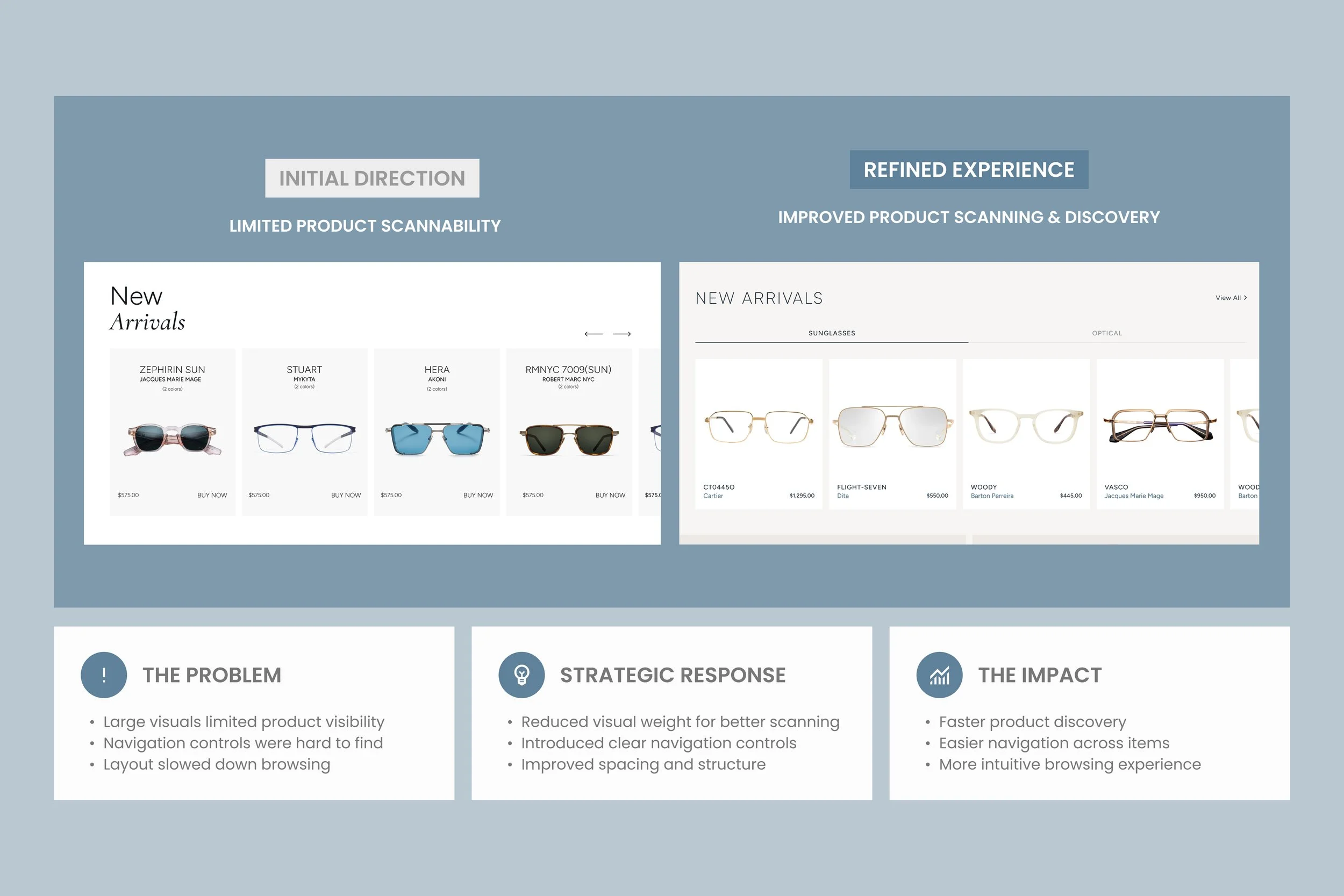
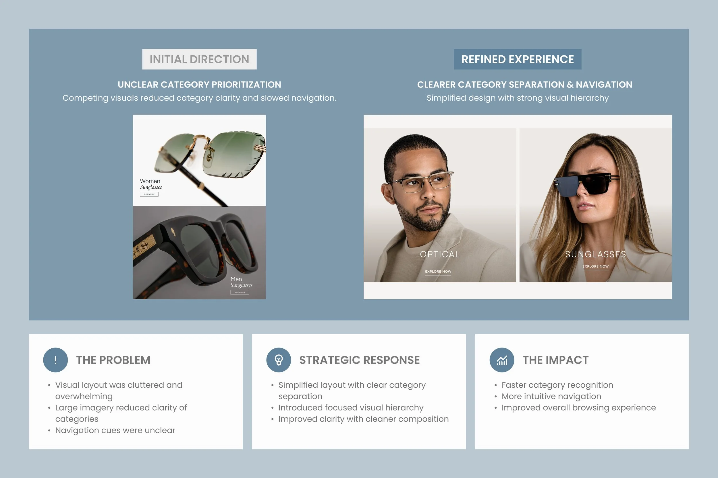
ENHANCING DESIGN THROUGH ITERATION
Exploring navigation models to unify commerce and services
The iteration phase focused on refining the experience through continuous evaluation of layout structure, interaction patterns, and visual hierarchy across key touchpoints. As the design evolved, adjustments were made to improve usability, strengthen consistency, and create clearer relationships between commerce and eye care experiences throughout the platform. This process helped shape a more polished and cohesive system while ensuring the final experience remained intuitive, scalable, and aligned with both user and business needs.
REFINING THE EXPERIENCE
Transforming the homepage experience
The refinement phase focused on strengthening the overall cohesiveness of the experience across navigation, content hierarchy, and interaction patterns. By continuously evaluating how users moved between shopping, product exploration, and eye care services, the design evolved into a more intuitive and connected system across key touchpoints. These refinements helped improve usability, reinforce consistency throughout the platform, and create a more polished experience aligned with both user expectations and the brand’s luxury positioning.

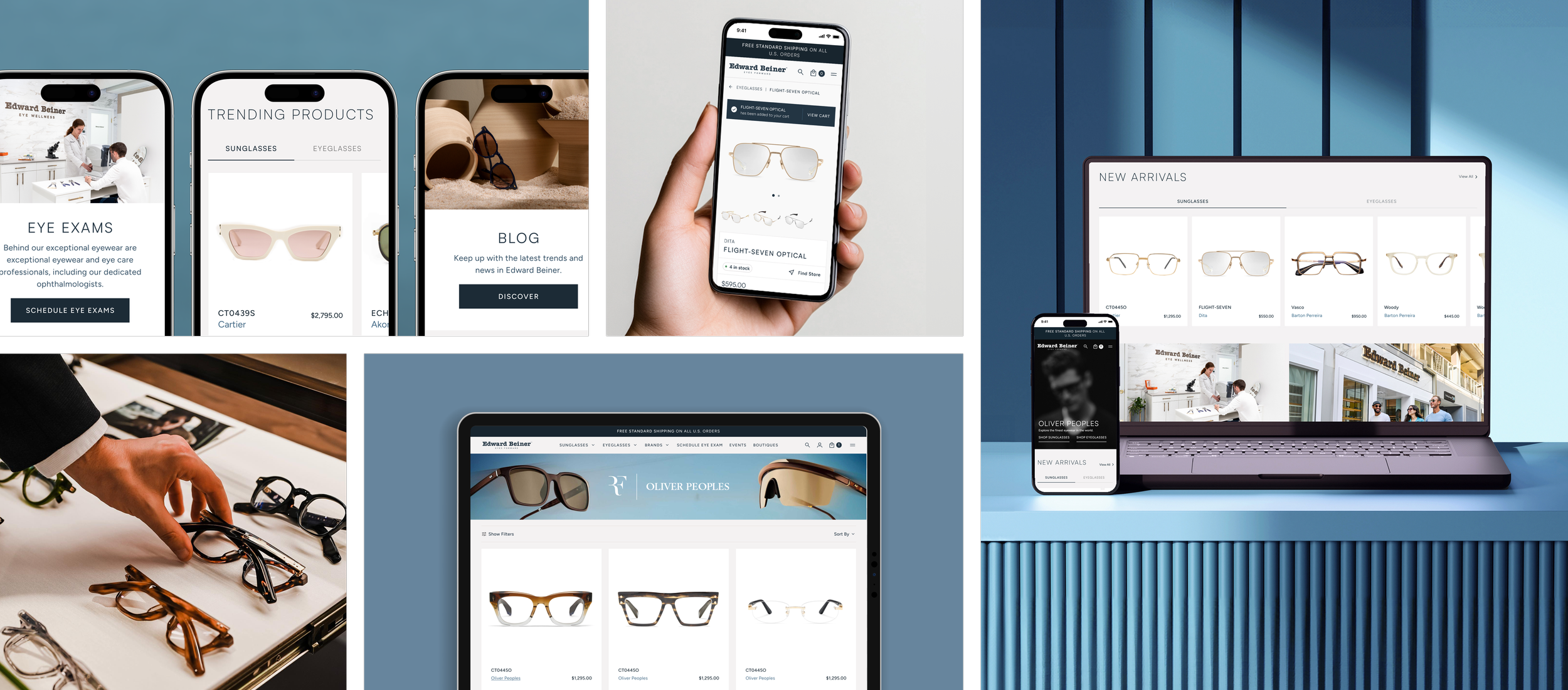
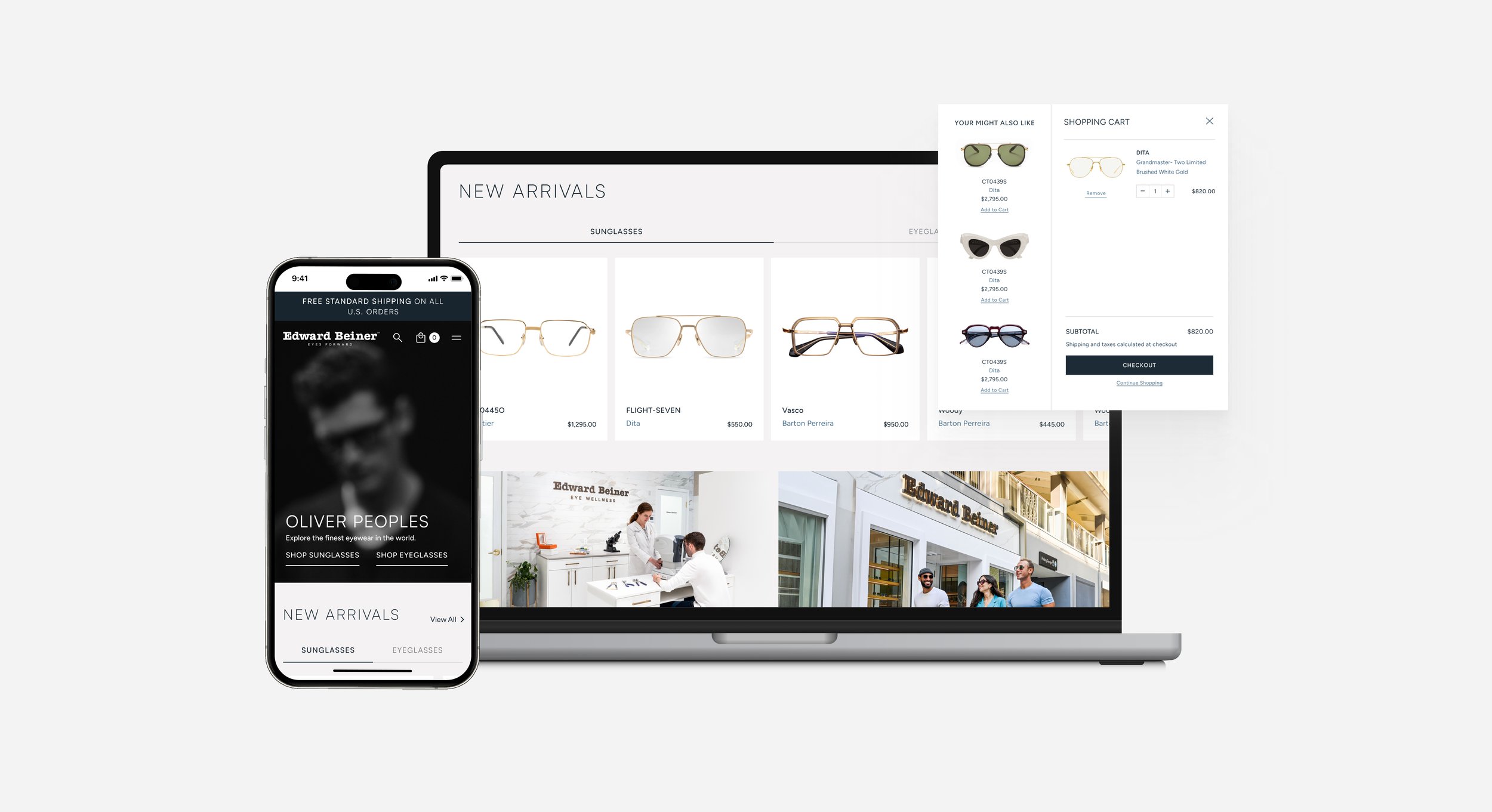
FINAL EXPERIENCE
Delivering a Seamless End-to-End Shopping Experience
The final experience brought together a more cohesive and scalable digital framework that unified luxury commerce with eye care services across the platform. Through refined navigation systems, clearer product discovery pathways, and more intentional interaction patterns, the redesign created a smoother and more connected customer journey across key touchpoints. The resulting experience aligned the brand’s premium positioning with a more modern, intuitive, and conversion-focused digital presence.

IMPACT
Driving measurable growth across key business metrics
The redesigned platform helped strengthen Edward Beiner’s digital presence by creating a more connected relationship between luxury commerce and eye care services. Improvements to navigation clarity, product discovery, and overall experience consistency supported stronger customer engagement across both digital and in-store touchpoints. The redesign also established a more scalable foundation for continued growth, helping position the platform as a more effective revenue and engagement channel for the brand..
CONCLUSION
Designing for scalability and long-term growth
The Edward Beiner redesign demonstrated how a more intentional and cohesive digital experience can better connect luxury commerce with service-based interactions. By refining navigation systems, simplifying product discovery, and strengthening customer pathways across the platform, the redesign helped create a more scalable and user-centered foundation for the brand’s continued digital growth. The project also reinforced the importance of aligning UX strategy, structural clarity, and visual refinement to create experiences that support both user needs and business objectives.